
")
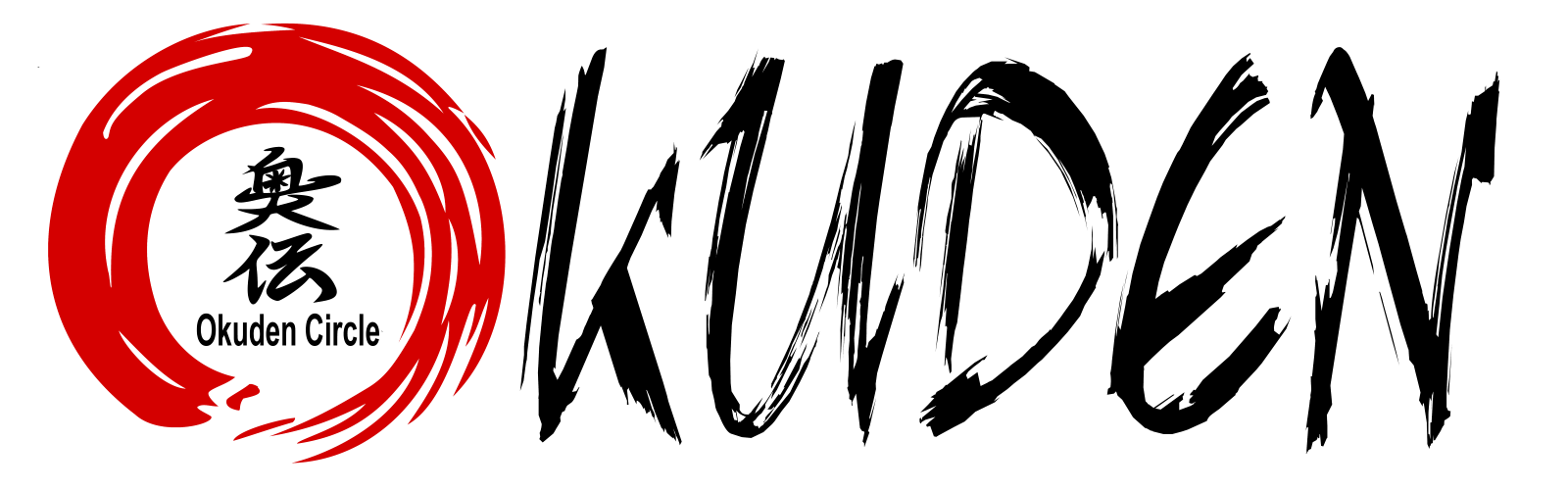
The Logo consists of two parts. The first one is the Kanji for OKUDEN (奥伝, Japanese: Communicating the inner art). The second one is the ENSŌ (円相, Japanese: Circle). Moreover it consists of two colours, red and white.
Explanation of the components:
OKUDEN (奥伝, Japanese: Communicating the inner art):
The Okuden Kanji denotes the distribution of the hidden or secret techniques or principles in a martial art. This means the cryptic teachings and high level principles.
Because Okuden Circle made it our goal to collect, learn and conserve them, the kanji was chosen.
The Okuden Kanji Colour:
For the colour of the Kanji we chose "white". White is the sum of all colours and reminds us on our goal to collect the sum of all principles and Okuden principles. In addition the colour white stands for ideals, goodness, humility, truth, science and accuracy.
Ensō (円相, Japanese: Circle):
The symbolism of the open Circle or rather the open Ensō-Symbol around the Kanji represents enlightment, strength, perfection, elegance and the emptiness. It is a circle or a ring that can be also seen as a union. In Japanese calligraphy there are two ways to draw an Ensō. One is with an opening and one is closed. Here the open Ensō was chosen deliberately. This symbolizes that it is a part of something bigger and does not stand alone. It also symbolizes that failure is an essential part of teaching. The main point, however, is that we are an open circle in which everyone has the freedom to learn with whom he wants, regardless of association, martial arts or affiliations.
The "Okuden Circle" strives for perfection, but is aware of the fallibility.
The Colour of the Circle:
For the Ensō symbol or the circle, the colour "red" was selected. In this context red should symbolize determination and perseverance, as well as the conscious experience and feeling, as well as passion.
In conjunction with the Ensō it should inspire us with will, determination and passion to strive for perfection and the goal of the circle